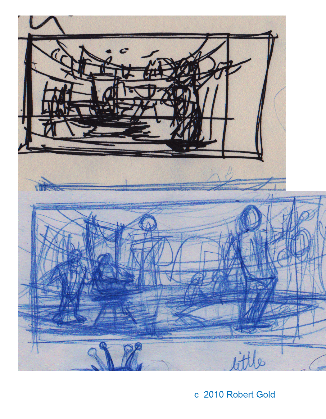
I also hope to use this as an example of how to build up a layout with ellipses. Here are a couple of thumbs...
 Of course, a ship is only as good as it's crew, these are just a few ideas I came up with...
...and here's the final rough. If you look at the two sillhouettes of in the distance, well, you can see how I struggled with trying to get the scale right, to get a sense of depth.

For the final, I started out with gray tones with the intention of using that as a base for colors, but then I realized that the black and white look kind of lent the piece a feel of an old "Flash Gordon/Buck Rogers" serial (well, I think so), so for now, I've left it like this. I didn't use any "gradients", trying to stick with solid areas of value.
