Wednesday, October 17, 2012

"The New Formal"

 Last week at the Academy, we were working on designing an elephant in formal attire, like he's going to the opera. I took it a step further and added a walrus. If you look closely at the rough of the Walrus, you can read where I scribbled the note "add monocle", which came from a suggestion, or more like a demand from one of my students. I think it was a good idea, and adds a nice touch. On a side note, blogger has this new feature that lets you pinpoint where your traffic is coming from. It looks like I got a visitor from Taiwan recently, for the first time!
c Robert Gold  2012
c  Robert Gold  2012


c  Robert Gold  2012

Saturday, October 13, 2012

"He's coming to get you, Barbara!"

 With Halloween coming, I thought I'd do an "homage" to zombies appearing in movies (or even on cable T.V. shows). I decided to tone it in gray, though not quite 50 shades. Below the final version, you can see an early concept in col-erase blue, and below that, the final pencil rough. I ended up moving the cheerleader down and slightly to the left, for the final, as well as scaling her up a bit.


Wednesday, July 25, 2012

Tuesday, July 03, 2012

"Narf!"-olepsy


 So, the other night in character design class, the subject of "Pinky and the Brain" came up, and I thought I would try my hand at drawing a "Pinky" from memory. I'd never drawn the character before, with or without reference. So here's the original drawing, direct from my sketch book. A "thumb"nail of "Pinky", if you will.
Then I went home, and after looking up the character in Google images, I did the drawing below, based on the pose I came up with earlier.
Then, finally I did a clean-up, and and added some color, which was kind of a no brainer. Uh...no "Brain"-er!? It's late. Thanks for stopping by! Gold, out.


Friday, June 08, 2012

Monday, May 21, 2012

Summer's Coming!

 So, I go for a couple of months without posting anything, and blogger makes some upgrades that make posting simpler and more versatile, once you can wrap your mind around them. We were doing an assignment in class involving posing two characters and making them relate to each other. I wanted to do a scene with a guy trying to impress a girl, and this is what I came up with. One correction I made from the rough involved the girls legs/feet, and getting them to overlap properly.


When I was drawing the boy, I really felt like I was drawing myself. Like, "Hey, girls!, Check out this drawing!".

Friday, March 02, 2012

Friday, January 27, 2012

Man in Tights

I did this for a birthday card for someone with whom my family recently became acquainted who is turning 50 this week. The inside reads, "Here's to another 50 epic years!".


Wednesday, November 30, 2011

Bedrock... in living color!

Here is the "Tarbucks" layout, with the final color.

Monday, November 14, 2011

Yabba Dabba Draw!

So, I've been staying productive with the job, teaching once a week and prepping my work for the upcoming CTN Animation Expo this coming weekend.http://http://www.ctnanimationexpo.com/ Meanwhile, here's the final version of the "Flintstonian" Target store. I fixed some of the color on the marquee, and I colored the hat brims on the security guards, which I neglected to do earlier.


I'm also working of ideas for other environs of Bedrock, making fun of more of our 21st century pop-culture and branding. Hopefully, you can make out what's happening in this next piece, and I've also shown you some "process" stages which may give you an some insight into my process, and can help explain how something kind of scribbly can develop into something solid that I hope is pleasing to look at.


Monday, November 07, 2011

Jurrassic "Art"

So, I am a) getting my work ready for the upcoming CTN Animation Expo coming up later this month, and b) doing some work in the style of the "Flintstones" after hearing about the Seth McFarlane re-boot, and c) giving the blog a much needed update.

I started off by thinking of "Flintstoney" versions of our contemporary popular brand names and corporate icons. Here is a rough (I went through quite a few versions before coming up wiht this one. I decided to play around with some character ideas. As it is today, certain pre-historic people just can't stay off the "shell phone". Note that the security guards don't have any weapons or radios, and are armed only with their wits. Good luck, gents.


Here above is the final rough...


...and below, the final, cleaned up, with all the color of a bowl full of Fruity Pebbles!


Saturday, August 20, 2011

Fast & "Fur"-i-ous

These are a few "rodent" characters which originally sprang from a demo I did for one of the students at the Academy. I got a tip that someone might be interested in some of these guys for a project, and, you know, you just never know about these things. A little sketch can provide the impetus for something big. I'll keep everyone posted. In the meantime, enjoy these drawings.


Thursday, August 04, 2011

Hungry Like The...

I was assisting one of the students at the Academy (who's name, I believe, is actually "Sunday". She's got no blog...yet! Hopefully, that will change). She was trying to put a "Wolf" character into action poses, and I tried my hand at a few (walking in profile, in 3/4, and what looks like a "leaning club bouncer" pose).


Wednesday, July 27, 2011

"Peace" it together

A spontaneous piece from the recent "Animation Nation" "Art Jam" last night. The theme, expressed in the title of the post, came from Charles*, who was sort of the "MC" for the evening. for more info, visit www.animationnation.com.
*Charles Zembillas, my friend/mentor/employer who runs the Animation Academy (www.the animationacademy.com), and the "Animation Nation" website.


Thursday, February 17, 2011

Plenty O' Horns

The other night, we were finishing up our weekly Tuesday night class at the Animation Academy, when I was assisting a student who was trying out some designs for "minotaur" characters. I decided to try my hand, and hoves at a few myself, and also included a couple of "satyr/pan" type characters. Here's what I came up with...


Saturday, December 25, 2010

...the...FINAL......frontier...

I thought about adding a few more "sci-fi" type environments to my book, and I thought I would include a few "process" pieces.
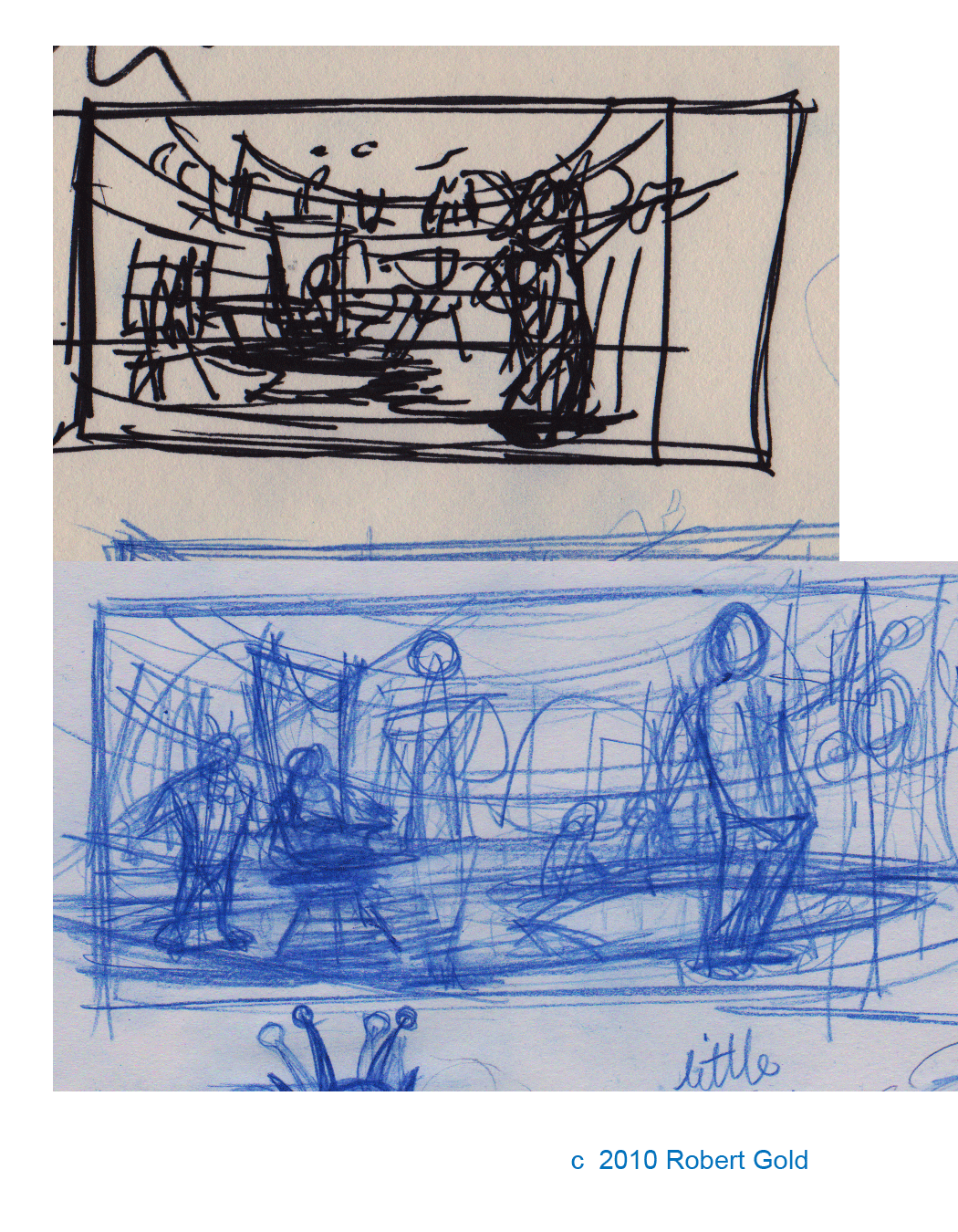
I also hope to use this as an example of how to build up a layout with ellipses. Here are a couple of thumbs...

Of course, a ship is only as good as it's crew, these are just a few ideas I came up with...

...and here's the final rough. If you look at the two sillhouettes of in the distance, well, you can see how I struggled with trying to get the scale right, to get a sense of depth.

For the final, I started out with gray tones with the intention of using that as a base for colors, but then I realized that the black and white look kind of lent the piece a feel of an old "Flash Gordon/Buck Rogers" serial (well, I think so), so for now, I've left it like this. I didn't use any "gradients", trying to stick with solid areas of value.


Sunday, November 28, 2010

Monday, November 22, 2010

The Gold Family Jewels

Just winding down from this past weekend's CTN Animation Expo in Burank. I updated my portfolio for the occasion and put some of my work into a little book that I distributed to friends, and a few industry people, and some people who are even both! I guess everyone, including me, loves "process" work, which are usually rough sketches done by hand. Here are a few of those for the "front page" of my booklet.
...the finished clean-up...
...and the final, in glorious color!I was going to have my contact info be the thing spelled out on the wall of the mine, but instead, chose to present it as a sort of "Wanted Poster" on the back of the booklet.