Thursday, March 19, 2009

"Unscripted"


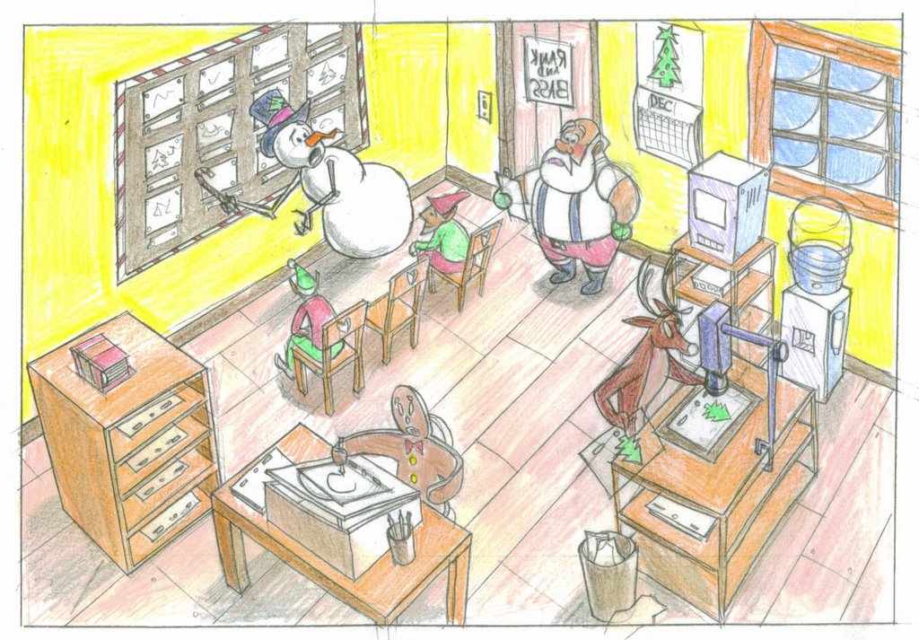
The title of the thread refers to a couple of animation related events I had the pleasure of attending at Samuel French's Theatre Bookstore in Studio City recently. Samuel French is best known as a publisher of play scripts, and these were a couple of book signings for animation and "Art of" animation books. This first event was last Thursday. It included Disney animator/producer Don Hahn, signing copies of "Alchemy of Animation" and legendary animator Eric Goldberg, signing his instructional book "Character Animation Crash Course"(a catchy title that only Eric would think of). Here's a window display in front of the store. If you don't know the alligator character, you soon will. He's Louis, Eric's character from "The Princess and the Frog" opening later this year around the holidays.I apologize for the focus, or lack thereof in these pictures. My digital photography needs some work. Anyway, here's a picture of Don Hahn examining the "Art of Monsters vs. Aliens" book, from the upcoming Dreamworks movie. Don has another book of his own, a retrospective of the notes of Walt Stanchfield, which is supposed to be hitting the shelves on March 28th, the same day that MvsA arrives in theatres.


Here's Eric holding a book which I think is about music in animated films. I think he actually ended up buying the book.


Eric: "With my foolproof system outlined in this book, you too, can become an ace animator, or you can just work in the front office!"


One of the unusual things about this event was the low turnout. You could pretty much count the people there on one hand, and that's almost counting Eric and Don! I ended up giving a member of the staff urls and info for animationnation.com and ASIFA Hollywood so that in the future, they can tap into the huge pool of enthusiasts in and around Los Angeles. In the meantime, I got a little one on one time with Eric.


It is really something to meet people face to face whom you mainly only knew from DVD special features, specials, etc., and to find them to be really down to Earth and easy-going in person. That is the case with Eric and Don. See the people outside the window holding scripts? There is a casting agency in Ventura right next door to the bookstore.


Eric and Don were kind enough to autograph their respective books. If you visit Samuel French's in Studio City (not to be confused with their Hollywood store on Sunset), they may still have some autographed copies available for purchase while they last.


A sign of a truly great artist, Eric is drawing one of his signature characters, the Genie from "Aladdin" which he created almost two decades ago. And with a sharpie! (i.e., no rough sketch first).


"We're Hahn, Gold & Goldberg, and we'll fight for you!"


The same venue, but with a slightly different vibe...

Just this past night, I returned to Sam French's for another event, a book signing for that "Art of Monsters vs. Aliens" book that Don Hahn was perusing. Here's a shot of the films art director, David James. To hear him speak about the film go to http://www.monstersvsaliens.com/, go to "behind the scenes", then to "the crew", then click on "David James", then click on "watch the interview". You got all that?Here's David with Linda Sunshine, who wrote the text for the book.

Here's a shot of the cover. The jacket artwork was created specifically for the book, and the size range of the characters supposedly made for quite a challenge to show them all in a group shot.

As you can see, the turnout was little higher this time, but it still made for a very intimate evening. (i.e. it certainly was not Comic Con).


This is a movie I'm really looking forward to. It was nice of Samuel French to hold two animation events over the course of less than a week, and very nice of Don, Eric, David and Linda to be so generous with their time. As they used to say in my Navy days, "Bravo Zulu"!


Thursday, March 12, 2009

A Bygone Classic...

This has always been one of my favorite buildings (L.A.s "Pan Pacific Auditorium) that is no longer with us. I had this idea to show it from a high angle, and from behind, with those flagpoles and art deco things in the foreground. Here is a reference photo, probably taken in the mid 80's. (the building was closed in the 70's and destroyed by fire in 1989. It lives on though, in movies like "Xanadu"). This is a rough sketch from my sketchbook which I did at the school in Burbank where I am an instructor. (www.theanimationacademy.com).Below is a more refined version. It's a basic 3 point perspective, with the flagpoles, light posts and other strong verticals, going to a third vanishing point below the picture plane.+


And below is the "cleaner" version, with some tone I added in photoshop. I'll be refining that in the future, as well as adding some figures (I may set the scene in the 60's). For the cars, I researched classic "Woodies" as well as "Edsels" and the Ford Fairlane.


A Classic lives on...

Visitors to Los Angeles looking for the location of the old Pan Pacific wil find this Rec Center in it's place. You can see the influence of the design of the original.And if you've been to Walt Disney World in Florida, you may know this place. You can see how th imagineers borrowed the design for the entrance to the "Studios" theme park (originally "Disney/MGM Studios").


Monday, August 18, 2008

I'm no Drew Struzan, but I thought I'd have some fun...

So, my Mom's birthday recently came to pass. I designed this as a card that I could market to other people. I'm just now getting the hang of photoshop, although I still have a LOT to learn.

Thursday, February 14, 2008

Thursday, September 20, 2007

An epic of Biblical proportions!

This is me attempting to assist a friend of mine in illustrating the "David and Goliath" story. Ready when you are, C.B.!


"...and he shall appear!"


Just having some fun. I modeled the nose partially off of my own (every drawing has an element of a self portrait, don't you think!), so he is indeed a handsome...well you know.

It's been five(5) looong months since my last post. Far too long. So, in commemoration of the New Year (5768), here's what I hope will be a long post which I hope you'll enjoy. Here's the rough drawing for my High Holiday card:
Here's the "clean" version.
Here is the completed image with color. The inscription inside reads "Shofar, Sho good":

Saturday, April 21, 2007

"A NOTE OF THANKS"

The task: To create a "thank you" card for my friends and family in Israel who were so kind and generous to me and my family on a recent visit over there earlier this month. The challenge: I was faced with the option of getting the card done quickly, or of sending them store bought cards provided by my mother. I was determined to avoid that at all cost, and to give the Israelis a card that would be unique, something specific to me. The result: A card created, drawn up, and printed, all in the course of about ten hours. (I was doing other things during the ten hours too, like unpacking, and recovering from jetlag).
As you can see, this all took place on April 16, 2007. After much brainstorming, for about 30 minutes, I came up with the brilliant idea of showing the words for "thank you" in Hebrew, but make it appear to be made out of ancient stone, weathered, and with clumps of grass growing from the cracks, like something in the old city of Jerusalem. Think of the "Ben Hur" poster. On top would be a non-descript figure, holding the Israeli flag. What could be more "me"? Here is the initial rough sketch, scanned directly from my sketchbook. Yes, Hebrew reading bloggers, it is spelled incorrectly. You can see me working out the correct spelling in the upper right hand corner. BTW, "Imcrazywonderful" is the handle of a Hebrew speaking girl whom I stumbled onto on MySpace. I made a note to check her out later.
Non-Hebrew speaking bloggers, did you know that Hebrew is written and read from right to left? Well, you know what? Hebrew is written/read from right to left! In the background on the right, is an "ancient" skyline, inspired again, by old Jerusalem, and by the port city of Jaffa (Yaffo). I think Mary Blair would like it. (Do a search on her). Getting there, but something isn't quite working...
This is more like it! Of course! Put the skyline on the left, so the letters lead to it rather than away from it!

Finally, I added some colors that would suggest old stone, using, fittingly enough, some old markers. Note to self: learn photoshop already. I used some lighter values for the background elements.
I then scanned the image, with the "Gold's Greetings" logo upside down, with the copyright and blog info, to create the back of the card. A trip to the printers, and I was done. Kind of crude, but effective. And most importantly, like nothing you could buy in a store. If it suits your purpose, feel free to print it yourself. It will need a little trimming, but should fit a 5"x7" envelope.

Saturday, March 31, 2007

It's been a while since I've posted, but thank you for coming by and visiting. Sorry, but I didn't get around to a Passover or Easter card this year, but as consolation, I've uploaded some of my other work that I dug up, and I've included some "process" pieces from the "Leprechaun" card. I hope you find them inspiring. It's my goal to make you feel good with my work. I would be remiss without mentioning Charles Zembillas and The Animation Academy, where I got a lot of my instruction (www.theanimationacademy.com). Also, for the latest buzz on the industry, from those inside it, or fans like myself hoping to break in, there's no better place than www.animationnation.com.


This is a piece that went over well with friends and colleagues. It incorporates 3-point perspective, with a curving horizon, character design posing and staging. (I act like I actually know what I'm talking about). On the "Falcon" building, you may notice references to the Chrysler building, as well as the Pan Pacific Auditorium, which no longer exists.

A cleaner version of my superhero, with some tone.

My tribute to B-movies. An attempt at "retro" futurism.
Here's how it all started. This is a rought sketch of the leprechaun, (which I just noticed got mirror reversed somehow) in col-erase blue.

Here is an experiment with tone using col-erase blue. I'm trying to get a balance of darks and lights throughout the piece. These blue tonal studies always remind me of tiles on a Dutch fireplace or something.
Here's the clean line version of the leprechaun. The circle and square that you see on the final card were done with the computer. This image was done with graphite. As you can see, I started experimenting with color on this one.

Thursday, March 15, 2007

Here is a better version of the Davinci leprechaun. The first one has some unsightly "stains" on his vest, which I was able to remove for this one.

Wednesday, March 14, 2007

St. Patrick's Day card

Here it is! My St. Patty's card, which, for the time being, you can print for free! I'm still in the process of getting used to this "blogging" thing, but I found that it's best to print these in "landscape" rather than "portrait". The first image is the inside of the card, with the second image (Da Vinci Leprechaun) being the front and back. Got it? After printing, cut along the green dotted line, fold in half, and you've got it! I hope my Catholic friends are still my "friends" since I'm having fun with one of their holidays, and "The DaVinci Code". Now, I've got to start working on Passover and Easter.


Monday, February 12, 2007

My first post this year. If you're reading this, it means you're visiting my contribution to the, what is it, the blogsphere? In appreciation, and just in time for Valentine's Day, you are welcome to make use of my first "printable" Valentine. To make your own, (two(2) actually), just print out the image below, (you might try saving it to your computer first), then print out the text page below on the back side. Cut along the dotted line and "voila", you're own caveman Valentine! (Thank you, Samuel L. Jackson). No charge for the use, but feel free to leave a comment! (one note: you don't have to use my text! Feel free to leave the inside blank and inscribe it with your own sentiment).

Saturday, December 16, 2006

Monday, October 23, 2006

Tuesday, April 25, 2006


This is an environment called "The Cave Of No Return"(which also happens to describe my bedroom, good luck finding your way out of there). It's a cave...from which..you don't return. It's all perfectly clear now, right? It's a location for a project that I may be involved with later this year.